The Antiquarian "A"
Nancy Johnson, the San Francisco Book Fair, and the story of the Antiquarian "A"
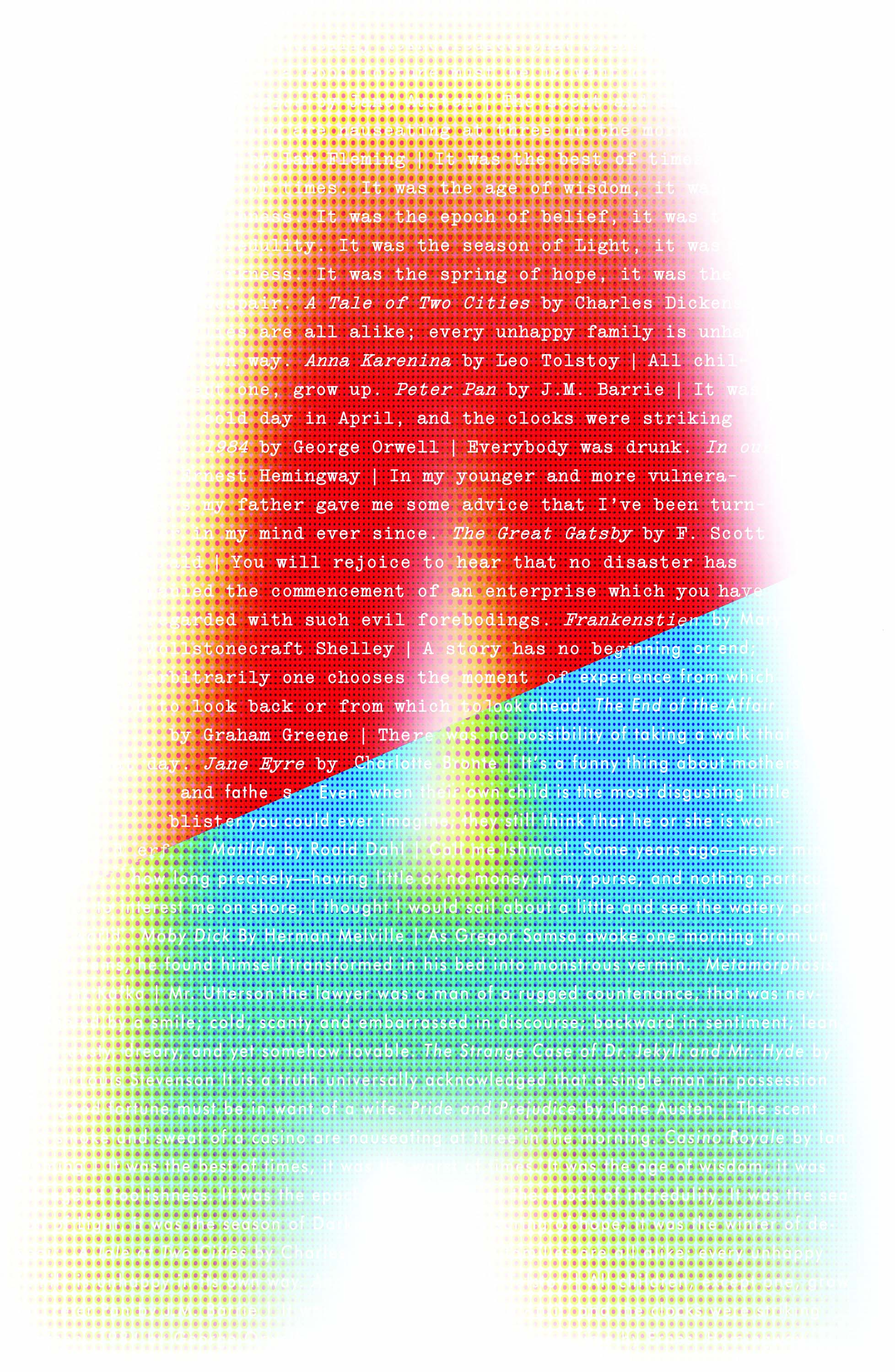
The 2020 Antiquarian "A"
When I acquired the long-running San Francisco Antiquarian Book, Print, & Paper Fair from Walter Larsen & Associates in 2011, I wanted to put my stamp on it, to create a signature or brand, but I had no immediate choice for a designer.
As fortune would have it, while I was managing the Hillsborough Antique Show in San Mateo, California that year, Kit Hinrichs (author, avid book collector, and one of the foremost poster designers), stopped by my booth. He signed a few copies of his most recent book, LONG MAY SHE WAVE, A GRAPHIC HISTORY OF THE AMERICAN FLAG. A lively conversation ensued, a long-running friendship took root, and the Antiquarian "A" was born.
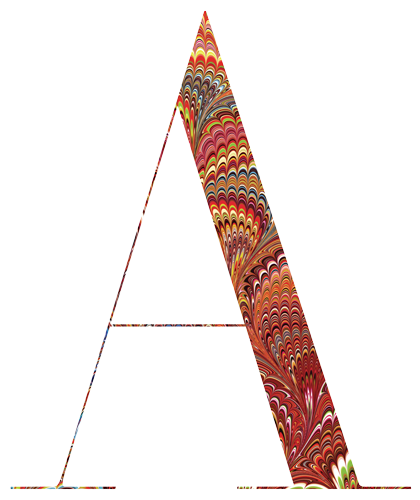
For the 2012 Fair Kit created a classic Firmin Didot letterform filled with marbleized paper of the type commonly found in the endpapers of antiquarian books. The combination of contemporary typography with the 17th-century paper style captured the essence of the inaugural event.
Each year Studio Hinrichs creates a unique "A." Kit puts a great deal of thought into the design of each one, and in so doing has definitely created a recognizable brand for the fair. Posters big and small, postcards in various sizes, and bookmarks (not just the San Francisco Fair but also for other fairs I own and/or produce, including the Sacramento Antique Show, the 20th Century Expo, and the 2014 and 2015 Hillsborough Antique Shows) have become collectible ephemera in their own right!
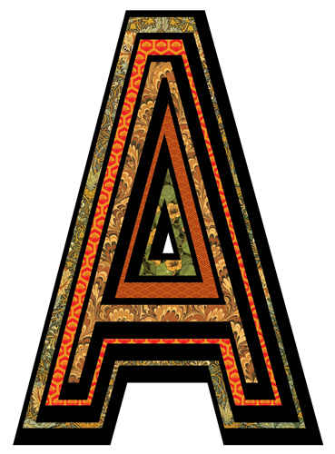
For 2014, Studio Hinrichs created the "A" based on a blackletter typeface, again with a strong reference to Victorian endpapers and early 19th century design.
I could not have been prouder when in 2017 Nancy Johnson Events LLC acquired a registered trademark for the San Francisco Antiquarian Book Print & Paper Fair®, the only privately owned trademark for a book fair in the U.S.
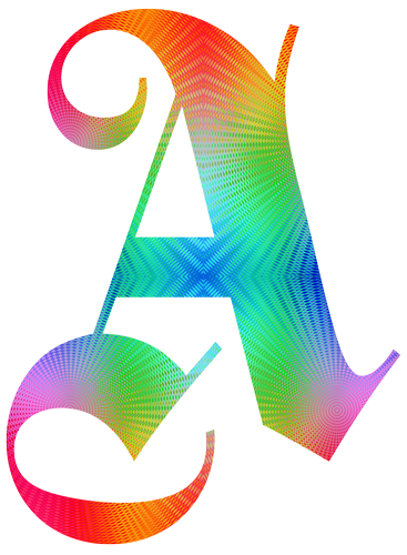
The 2016 poster was debuted in April of 2015, combining psychedelic imagery with classical German typography, fusing a 14th-century style with the Avant Garde imagery of the '60s.
That was topped though, when the next year the Fair moved into a permanent location (the South San Francisco Conference Center), and due to its success and the subsequent demand for an event that would attract high level exhibitors but not require them to join an association in order to participate, I was able to launch a new fair, scheduled for February 2019, once again with Kit's design expertise by my side.
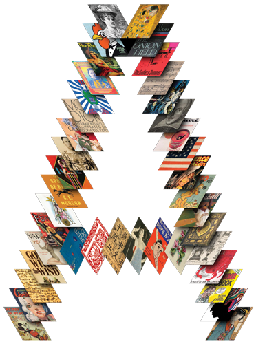
2018 featured an intricate collage of diverse material, representing the variety that can be found at the show, from rare editions to icons of pop culture, classic posters to comics, historical touchstones to scarce ephemera.
I once asked Walter Larsen why there was not an annual Fair, and his reply was that he expected me to make it so.
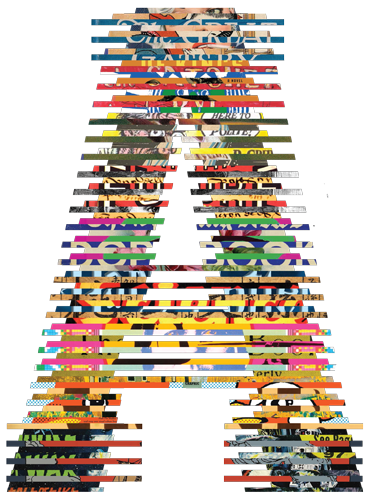
"You never know what to expect at the Antiquarian Book Fair," says Kit. "So for 2019 we've taken that cacophony of imagery, color, and energy, and merged it into a vast tapestry of literary symbols. We've used the structure of two classic type styles — Franklin Gothic and Stymie Bold — to convey a glimpse into the world of literature."
Well, it took from 2011 to 2018 to do it, but I think I can safely say: I — and Kit's Antiquarian "A" — are here to stay!